The secret to successful maximalism isn’t acquiring more, but applying rigorous compositional discipline.
- Treat your space like a gallery, with every object earning its place through a strict “curator’s edit.”
- Mastering a cohesive color story and varying pattern scale is more critical than the sheer number of items you own.
Recommendation: Embrace a disciplined framework of layering, negative space, and visual hierarchy to transform your collection from potential clutter into a cohesive, personal narrative.
For the creative homeowner, the allure of maximalism is undeniable. It’s a style that celebrates personality, history, and the joy of collection. Yet, within the charming constraints of a smaller urban property, this love for abundance can quickly teeter on the edge of chaos. The common advice to simply embrace “more is more” often leads to a space that feels cramped and visually overwhelming, rather than rich and curated. Many fear that their passion for colour, pattern, and treasured objects will inevitably result in a cluttered, messy look they desperately want to avoid.
The prevailing wisdom suggests layering textiles and filling every nook, but this often ignores the fundamental principles that make maximalism work. It’s not a free-for-all. The most breathtaking maximalist interiors are not accidents of accumulation; they are masterpieces of controlled chaos, governed by a set of unspoken rules. The real challenge isn’t finding more things to love, but learning how to compose them with intention.
But what if the key to unlocking lush, layered, and livable maximalism in a small space wasn’t about adding more, but about introducing a surprising element: discipline? This guide rejects the notion of haphazard collecting and instead offers the perspective of an eccentric but disciplined interior designer. We will explore the rigorous compositional rules that underpin the most successful maximalist designs, treating your home as a canvas for curated abundance, not a storage unit for beautiful things.
This article provides a structured framework for layering without clutter. We will deconstruct the core elements of disciplined maximalism, from the strategic use of negative space to the fine art of pattern-clashing, empowering you to build a space that is both deeply personal and impeccably composed.
Table of Contents: A Guide to Curated Abundance
- Why Negative Space Is Crucial Even in Maximalist Design
- How to Create a Cohesive Colour Palette with 5+ Hues
- Gallery Wall or Statement Wallpaper: Which Suits a Narrow Living Room?
- The Pattern Clashing Mistake That Causes Visual Headaches
- When to Stop Adding: Recognizing the ‘Finished’ Point
- Why Ultra-Modern Furniture Can Look Cheap in Period Homes
- The Scale Error That Makes High Ceilings Look Empty
- How to Choose Statement Art for Rental Properties Without Damaging Walls?
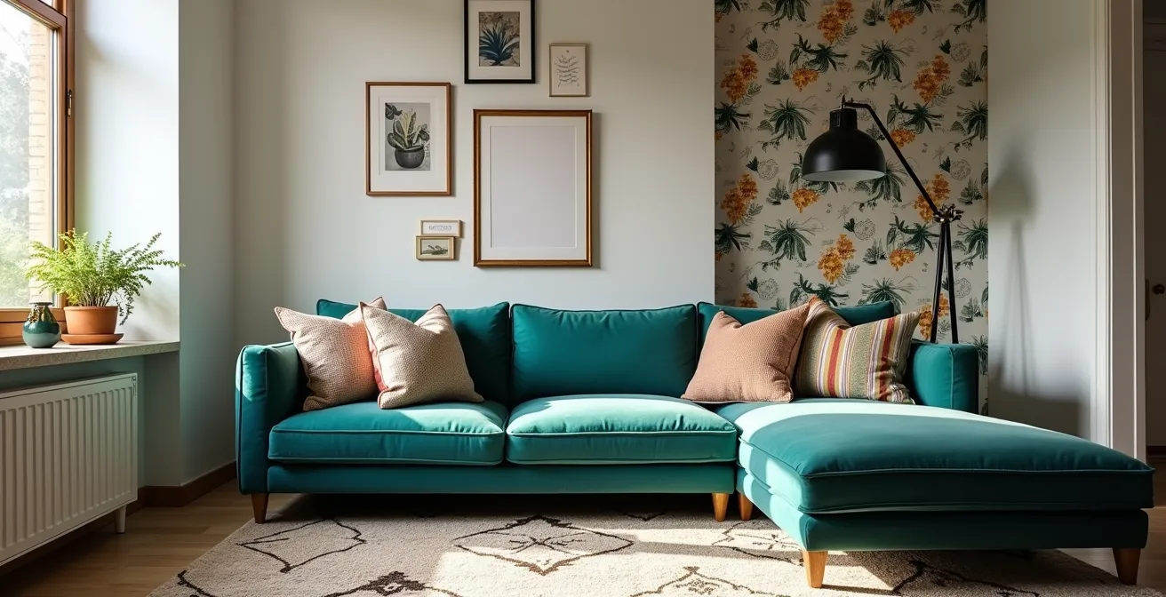
Why Negative Space Is Crucial Even in Maximalist Design
The most common misconception about maximalism is that it is the sworn enemy of empty space. In reality, negative space—the “blank” areas on a wall, a shelf, or a floor—is the silent partner that makes abundance sing. Without it, a collection of beautiful objects dissolves into visual noise. Think of it as the pauses in a piece of music; they give rhythm and emphasis to the notes. In a small, layered interior, these moments of visual quiet are what prevent a room from feeling suffocating.
This principle is central to the idea of a “curator’s edit.” A museum curator doesn’t fill a gallery from floor to ceiling. They select key pieces and give them room to be appreciated. The same logic applies to your home. By deliberately leaving a portion of a bookshelf empty or a section of a wall plain, you create a visual hierarchy. This “breathing room” draws the eye to your statement pieces, allowing them to truly shine as the “stars” of the show. It’s a display of confidence, showing that every item is present by choice, not by accident.
High-end interior designer Peti Lau champions this disciplined approach, suggesting a story-based curation. In a Redfin feature on achieving maximalism in small spaces, she advises starting with one beloved object and building a narrative around it, layering in complementary colors and patterns as “supporting roles.” This is the essence of controlled chaos: every element has a purpose within the larger composition.
Case Study: Peti Lau’s ‘Star and Supporting Roles’ Method
Designer Peti Lau reframes maximalism as a narrative exercise. “The art of maximalism design in minimalist and small spaces is about curation and editing,” she states. “You take something that you really love… then building a story around this beloved item… create a story with this object by making it the ‘star.’ Then adding the supporting roles, layer in colors that complement this item. Introduce a pattern that will play nicely with this item.” This method transforms accumulation into thoughtful storytelling, ensuring every piece contributes to a cohesive whole rather than just taking up space.
Adopting this mindset means you are not just decorating; you are composing. It’s a shift from “how much can I fit?” to “what does this arrangement need?” Sometimes, what it needs most is a patch of quiet to make the rest of the room feel intentional and luxurious.
How to Create a Cohesive Colour Palette with 5+ Hues
A maximalist room lives and dies by its colour palette. While minimalist design might stick to a tranquil trio of hues, a disciplined maximalist confidently wields five, six, or even seven colours without descending into chaos. The secret isn’t a magical eye for colour, but a set of structured techniques that weave disparate shades into a harmonious whole. A large palette feels curated, not chaotic, when there is an underlying logic connecting the colours.
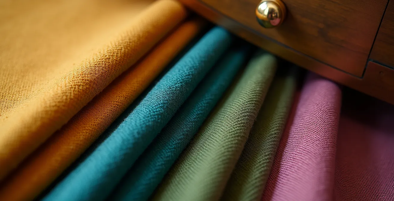
The most effective technique is “colour threading.” This involves selecting one or two unifying colours—often a metallic like brass or a strong neutral like black—and repeating them in small doses throughout the room. A brass drawer pull might speak to a brass picture frame, which in turn echoes the leg of a side table. This thread acts as a common language, tying together a wild mix of jewel tones, pastels, and earthy shades. It gives the eye a path to follow, creating a sense of rhythm and deliberate composition across different objects and textiles.
This image demonstrates how a single accent, like brass, can be “threaded” through various textures and objects to unify a complex colour scheme.
Another powerful method is creating a story-based palette, where all your colours are pulled from a single source of inspiration, such as a vibrant painting, a patterned rug, or a piece of fabric. By borrowing your hues from an existing, harmonious composition, you ensure they will relate to one another organically. This approach removes the guesswork and grounds your bold choices in a cohesive and personal narrative.
Ultimately, a complex palette requires a clear hierarchy. The following table breaks down several professional techniques for creating harmony from a multitude of hues, as detailed in an analysis of advanced pattern and color mixing.
| Technique | Number of Colors | Key Principle | Best For |
|---|---|---|---|
| Thread Colors | 5-7 colors | Anchor patterns with 3-5 unifying colors for consistency. Let one dominate, and the others harmonize | Complex maximalist schemes |
| Shared Undertones | 4-6 colors | All colors share muddy or jewel-toned undertones | Preventing chaotic effect |
| Story-Based Palette | 5+ colors | Base palette on tangible inspiration object | Organic color relationships |
| 60-30-10 Rule | 3 main colors | 60% dominant pattern, 30% secondary, and 10% accent | Structured maximalism |
Gallery Wall or Statement Wallpaper: Which Suits a Narrow Living Room?
The long, narrow living rooms common in urban properties present a unique compositional challenge. The walls become dominant features, and how you treat them can either exaggerate the “tunnel” effect or create a sense of width and intrigue. Two popular maximalist choices, the gallery wall and statement wallpaper, offer very different solutions. The right choice depends on the specific mood and function you want to achieve.
A gallery wall creates an interactive, detailed experience. It invites viewers to come closer, to inspect individual pieces, and to piece together the story of your collection. In a narrow room, this works best on a long wall, turning a simple passageway into a destination. By mixing frames, mediums, and sizes, you create a rich tapestry that adds depth and personality. It’s a celebration of the collected and the personal, as seen in a 400-square-foot Philadelphia studio where family heirlooms and personal art are layered to create a deeply individual space.
Conversely, statement wallpaper offers an immersive, atmospheric experience. Instead of multiple focal points, it creates a single, unified mood. In a narrow room, this is a powerful tool for manipulating perception. Applying a bold, large-scale wallpaper to the short end walls can visually “push” them out, making the room feel wider. For transitory spaces like hallways or powder rooms, a wild, unexpected wallpaper can be a “tantalizing feast for the eyes,” creating a memorable moment without overwhelming a primary living area. A high-gloss or lacquered finish can also work wonders, reflecting light to add a magical, expansive quality, especially at night.
The decision comes down to a simple framework: do you want to invite close inspection (gallery wall) or create an all-encompassing mood (wallpaper)? A gallery wall is a story told in chapters; a statement wallpaper is a single, powerful declaration.
The Pattern Clashing Mistake That Causes Visual Headaches
Mixing patterns is the high-wire act of maximalist design. Done right, it’s a symphony of visual texture that feels sophisticated and bold. Done wrong, it’s a cacophony that causes literal visual headaches. The most common mistake is not the clashing of styles (florals and geometrics can be best friends), but the clashing of scale. Using multiple patterns of a similar size and density creates a flat, competitive visual field where the eye doesn’t know where to rest.
The cardinal rule of successful pattern mixing is to vary scale dramatically. A large-scale, dominant pattern (the “lead”) needs to be paired with a medium-scale pattern (the “support”) and a small-scale, subtle one (the “accent”). This creates a clear visual hierarchy. Your eye is drawn to the large pattern first, then it explores the medium one, and finally discovers the small one as a textural detail. For reference, design resources often suggest small-scale pattern repeats are usually 1″-4″, while large ones can be 12 inches or more.
As designer Sophie Ashby notes in a masterclass for Homes & Gardens, the key is contrast. Her advice is to “mix opposites.”
Try to mix opposites. If you’re going to have a really large scale floral, then don’t use another large scale floral. Instead, try a tiny scale floral or, even better, a little geometric.
– Sophie Ashby, Homes & Gardens Pattern Mixing Masterclass
To implement this, follow a simple framework. Choose one bold, large-scale pattern to be the star—perhaps on a rug or curtains. Then, introduce a medium-scale pattern, like a geometric on throw pillows, that shares at least one colour with your lead pattern. Finally, add a third, small-scale pattern, such as a subtle pinstripe on a lampshade or a tiny floral on a vase. This disciplined approach ensures your patterns support each other rather than fight for attention, resulting in a look that is dynamic yet perfectly composed.
When to Stop Adding: Recognizing the ‘Finished’ Point
For a maximalist, the most difficult question is often “When is it done?” In a style defined by abundance, the line between “curated and complete” and “cluttered and chaotic” is perilously thin. Recognizing the ‘finished’ point is not about reaching a certain number of objects, but about achieving a state of purposeful balance. This requires stepping back from the thrill of adding and moving into the disciplined mindset of an editor.
The first and most important principle is the “One In, One Out” policy. Once you feel your room is balanced, this rule becomes your guardrail against clutter. If you bring a new cushion into the room, an old one must leave. This forces you to be deliberate about every acquisition, ensuring that new items truly enhance your vision rather than just adding to the volume. This is the core of the Marie Kondo method applied to maximalism: surrounding yourself only with items that add value and bring joy, maintaining a curated collection rather than a chaotic hoard.
Case Study: The Marie Kondo Method Applied to Maximalism
It may seem counterintuitive, but the ‘spark joy’ philosophy is a powerful framework for disciplined maximalism. The process isn’t about minimalism, but about mindful curation. By carefully considering what “truly brings you joy and adds value to your space,” you maintain the fine line between maximalist and cluttered. This intentionality is what separates curated collections from chaos, ensuring every single item has earned its place in your home’s story.
Beyond this policy, a series of practical tests can help you determine if your space is ‘finished.’ Does the room still function? Can you open every drawer and walk through without turning sideways? Does every object have a designated home, or are things just perched precariously? When you step back and squint, does the room resolve into a cohesive whole, or is it just a jumble of disconnected items? The moment the answer to any of these is no, you have likely crossed the line and it’s time to edit, not add.
Action Plan: The Four Tests for Maximalist Completion
- Apply the ‘One In, One Out’ Policy: Be deliberate about new acquisitions. To avoid unnecessary stuff, ensure any new item aligns with your vision and serves a purpose before it comes home.
- Conduct the Functionality Test: Can you perform every necessary function easily? Can you open every drawer, walk without turning sideways, and comfortably put down a drink on a clear surface?
- Check the Point of Cohesion: Step back and squint your eyes. Does the room resolve into a cohesive whole with a clear visual hierarchy, or does it look like a jumble of competing items?
- Perform the ‘Resting Place’ Test: Does every single object have a deliberate, designated home? Nothing should feel temporarily perched or “in transit.”
- Consider Space Limitations: Before bringing in anything new, ask yourself honestly if you have enough space to keep it without it making the room feel overstuffed.
Why Ultra-Modern Furniture Can Look Cheap in Period Homes
Juxtaposition is a powerful tool in a maximalist’s arsenal, but the pairing of ultra-modern furniture with the ornate architecture of a period home is a delicate dance. When done without thought, a sleek, minimalist piece can look jarringly out of place, almost like a temporary placeholder. It can lack the visual weight and textural complexity to stand up to high ceilings, intricate moldings, and the inherent history of the space, making it feel flimsy or “cheap” by comparison.
The key to a successful marriage of old and new is not to ignore their differences, but to create a deliberate dialogue between them. A successful piece of modern furniture in a period setting doesn’t try to blend in; it complements. This often means choosing modern designs that have their own sculptural quality and material richness. Think of an Eames lounge chair: its curved plywood and supple leather have enough character and warmth to hold their own against a Victorian fireplace. A generic, mass-produced plastic chair, however, would likely fail this test.
This image of an iconic modern chair in a classic Victorian setting shows how the dialogue between old and new can create a sophisticated, layered interior when the modern piece has sufficient character and material integrity.
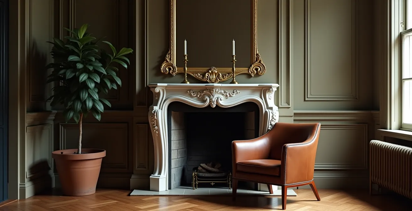
As noted by observers of design trends, true maximalism is about fearless experimentation with aggressive extremes, not just accumulating stuff. The number of items is less important than the impact each one makes. A well-chosen modern piece can provide a “wow” moment by creating an exciting clash of texture and form—a rough, historic wall against a smooth, sculptural countertop, for example. The goal is a confident contrast, not a timid attempt to match. The modern piece must have enough presence to be a worthy sparring partner to the room’s history.
The Scale Error That Makes High Ceilings Look Empty
High ceilings are often seen as a blessing in small urban homes, but in a maximalist context, they can present a significant challenge: the dreaded “empty void.” When all the furniture, art, and decor are kept at or below eye level, the upper portion of the room can feel disconnected and barren, making the space feel bottom-heavy and unfinished. The scale of your decorative elements must match the scale of your architecture.
The solution is to think vertically and create “visual ladders” that draw the eye upward, connecting the floor to the ceiling. This can be achieved in several ways. Floor-to-ceiling bookshelves are a classic choice, turning an entire wall into a feature that is both functional and decorative. Hanging curtains well above the window frames, close to the ceiling line, instantly adds a sense of grandeur and height. Even the way you hang art can make a difference; instead of a single, small piece, opt for massive, oversized art or a dense gallery wall that occupies a significant portion of the vertical space.
Lighting is another crucial tool for conquering vertical space. A single, central ceiling fixture is rarely enough. A disciplined maximalist layers lighting to add warmth and depth. The goal is to have multiple points of light at different heights—a combination of ambient (ceiling), task (reading lamps), and accent (spotlights on art) lighting. Using light fixtures as decorative elements in their own right, with at least five to seven light points in a room, helps to populate the vertical space and make it feel considered and whole.
Finally, don’t be afraid to use paint strategically. While light colours make a room feel airy, painting a high ceiling in a dark, dramatic colour can make it feel closer and more present, creating a cozy, enveloping effect that is a hallmark of successful maximalism. It’s a bold move that turns the “fifth wall” into an integral part of the composition.
Key Takeaways
- Embrace Negative Space: The most crucial element in a maximalist room is “breathing room.” Deliberate blank spaces on walls and shelves prevent chaos and allow your statement pieces to shine.
- Master “Colour Threading”: To unify a palette of 5+ hues, choose a single accent colour or metallic (like brass) and repeat it in small doses throughout the room to create a cohesive visual path.
- Vary Pattern Scale Dramatically: The secret to successful pattern mixing isn’t matching colours, but contrasting scales. Always pair large, medium, and small-scale patterns to create a clear visual hierarchy.
How to Choose Statement Art for Rental Properties Without Damaging Walls?
For a creative homeowner in a rental property, the desire for a bold, maximalist statement often collides with the strict “no nails, no damage” clause in their lease. The fear of losing a security deposit can lead to bland, impersonal walls, the very antithesis of the maximalist spirit. Fortunately, achieving a high-impact look without a single nail is not only possible, but it can also lead to more creative and dynamic solutions.
One of the most effective and damage-free methods is the sophisticated “Leaning Method.” Instead of hanging art, source oversized framed pieces or large, ornate mirrors and simply lean them against the walls. Placed on the floor, a console table, or a mantle, this technique creates a relaxed, effortlessly stylish look. It gives the art a sculptural presence and allows you to easily move and rearrange your display. A large mirror, in particular, earns its keep by reflecting the room’s layers, doubling the impact of your decor while adding depth and light.
Case Study: The Power of Peel-and-Stick Wallpaper
For a major statement without commitment, peel-and-stick wallpaper is a renter’s best friend. As demonstrated in a feature by Moda Misfit on small-space maximalism, creating a single accent wall with a dramatic, removable print can do “all of the maximalist heavy lifting” in one action. It introduces bold color and pattern without taking up any floor space, making it a perfect solution for small bedrooms or living areas where every square inch counts.
Beyond leaning, you can build displays on furniture. Tall bookshelves can become vertical galleries, and decorative easels can turn a single painting into a moveable focal point. Textiles also offer a powerful, damage-free alternative. A beautiful rug or an intricate textile can be hung from a tension rod or a single picture rail system, which requires minimal drilling (often just two holes for the entire rail) but allows for endless, damage-free changes. These techniques transform limitations into a creative prompt, forcing a more thoughtful and often more interesting approach to displaying art.
By now, it should be clear that masterful maximalism is an art of composition, not just collection. It is the thoughtful application of rules—governing space, color, pattern, and scale—that elevates a room from a storage space for beloved objects into a cohesive and deeply personal sanctuary. The discipline is not a restriction of creativity; it is the very framework that enables it to flourish. Begin today by applying this curated approach to transform your space into a testament to your unique story, told with abundance and impeccable style.