The secret to modernising a Victorian home isn’t ‘contrast’—it’s ‘coherence’. True style comes from matching the integrity and craftsmanship of new pieces to the home’s historic soul.
- Cheap, mass-produced modern furniture often fails due to a lack of material integrity, not just an opposing style, which clashes with the solid craftsmanship of period architecture.
- Successful blending relies on creating a ‘tonal bridge’—a repeating colour, material, or texture that connects period features with contemporary elements into a unified whole.
Recommendation: Prioritise investing in well-made contemporary pieces that honour the quality of your home’s original architecture, ensuring a dialogue between eras, not a shouting match.
As the owner of a Victorian or Edwardian terrace, you possess a piece of British architectural history. The high ceilings, ornate cornicing, and handsome chimney breasts hold a gravitas that is both a privilege and a puzzle. The most common question I hear from clients in my London practice is how to make these spaces work for modern life without erasing their soul. The internet is full of advice to “juxtapose old and new,” a vague platitude that often leads to homes feeling disjointed, with minimalist furniture looking adrift and out of place against a backdrop of rich, historical detail.
Many guides suggest a ‘safe’ neutral palette or simply tell you to keep the original features, without explaining how to make them feel relevant. This can result in a space that feels more like a museum than a home, or worse, a confused battle of styles. The core issue isn’t about simply placing a modern sofa in a period room. It’s about understanding the language of the house and teaching your new additions to speak it fluently.
But what if the key wasn’t stark contrast, but a carefully curated dialogue? This guide moves beyond the generic to offer a new perspective: success lies in matching the integrity of craftsmanship and material quality, not just clashing styles. It’s about building a bridge between the 19th and 21st centuries, where every object, new or old, feels like it belongs. We’ll explore how to choose the right furniture, the strategic use of paint and light, and how to make architectural features the hero of your home, not a historical footnote.
This article provides a structured approach to creating a home that is both respectful of its past and perfectly suited for the present. We will break down the core principles and apply them to the specific challenges of Victorian homes, from narrow hallways to maximalist layering.
Contents: How to Master Modern Victorian Interior Design
- Why Ultra-Modern Furniture Can Look Cheap in Period Homes
- How to Mix Vintage and Contemporary Decor in 5 Steps
- Paint or Wallpaper: Which Best Highlights Original Cornicing?
- The Mistake of Removing Chimney Breasts That Devalues Your Home
- How to Brighten a North-Facing Hallway with Mirrors and Paint
- Why Lighting Is the ‘Jewellery’ of the Room
- Gallery Wall or Statement Wallpaper: Which Suits a Narrow Living Room?
- Maximalism in Small Spaces: How to Layer Without Cluttering?
Why Ultra-Modern Furniture Can Look Cheap in Period Homes
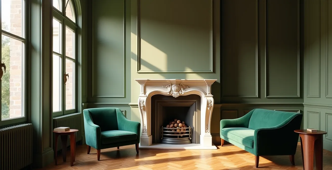
The allure of a sleek, minimalist sofa or a high-gloss media unit is strong, but placing it in a Victorian terrace can often feel jarringly wrong. The issue isn’t a simple clash of “old versus new.” It’s a conflict of material integrity. Victorian homes were built with solid, substantial materials: thick plaster, solid wood, and cast iron. These elements have a physical and visual weight. When a piece of mass-produced, flat-pack furniture made of MDF and laminate is placed beside them, it’s the lack of comparative quality and craftsmanship that makes it look cheap, not its modern design.
This is also a financial consideration. Retaining and celebrating these features is a wise investment, as UK property market analysis confirms properties with preserved period features can command up to 20% higher value. The key to successful integration is to choose contemporary pieces that share the same ‘honesty’ of materials—think solid wood, real stone, woven textiles, and well-crafted metal. A modern oak dining table with clean lines can sing next to an original fireplace because they both share a truth to their material.
Case Study: Tufnell Park Victorian Terrace
The renovation of Leanne Kilroy’s London home provides a masterclass in this principle. Instead of inserting generic modern units, she preserved ornate cornicing and designed a custom kitchen with a level of craftsmanship that echoed the home’s original build quality. This proves that success is found in a coherent dialogue of quality, ensuring new elements are worthy of their historic setting.
The goal is to curate a collection of pieces where the new respects the old, not by imitation, but by sharing a commitment to quality. This approach ensures your modern additions elevate the space rather than devaluing its inherent character.
How to Mix Vintage and Contemporary Decor in 5 Steps
Creating a harmonious blend of period and modern is less an art and more a structured process. It’s about establishing a clear hierarchy and ensuring every element communicates with the others. Forget the idea of random juxtaposition; instead, think of yourself as a curator building a cohesive story. This requires a plan that respects the home’s “good bones” while allowing for personal, contemporary expression. The 80/20 principle is your most powerful tool here: let the architecture lead the conversation.
The aim is to create ‘tonal bridges’—elements of colour, material, or form that link different eras. For instance, the brass from an original door handle can be echoed in the legs of a modern armchair. This creates a subtle, unifying thread that the eye follows, making the blend feel intentional and sophisticated rather than accidental.
The visual harmony seen here is not accidental. It is the result of applying a clear framework where the period architecture provides a grand stage for carefully chosen contemporary pieces. This balance prevents the space from feeling like a sterile showroom or a stuffy museum, achieving a lived-in, authentic elegance that is the hallmark of a well-styled heritage home.
Your Blueprint: Mixing Eras in 5 Steps
- Establish your 80/20 foundation: Keep 80% of the core elements (walls, floors, architectural features) sympathetic to the period, reserving 20% for bold, contemporary accents like art, lighting, or a key piece of furniture.
- Create a connecting thread: Identify a colour from original features, like Minton tiles or stained glass, and repeat it in your modern furnishings to create a visual link.
- Source authentically: Combine genuine period pieces, perhaps from UK antique markets, with high-quality contemporary items from curated designers. Avoid cheap reproductions.
- Use neutral zones: Employ large, single-colour rugs or broad strokes of neutral paint on secondary walls to act as a calm ‘bridge’ between ornate period details and clean modern lines.
- Layer lighting: Pair a traditional ceiling rose not with a chandelier, but with a striking modern pendant. This single act can define the room’s entire design philosophy.
Paint or Wallpaper: Which Best Highlights Original Cornicing?
The magnificent plasterwork of Victorian cornicing is one of the most coveted original features, but how to treat it is a source of great debate. The default approach for decades has been to paint the ceiling and cornice brilliant white to ‘lift’ the room, with a contrasting colour on the walls. While safe, this can create a stark, horizontal line that visually lowers the ceiling and turns the cornice into a decorative border rather than an integrated part of the architecture.
A more forward-thinking approach is to use colour to create a more cohesive and immersive experience. Painting the walls and cornice in the same colour can blur the boundary between them, making the cornice’s texture and shadow play the main event. This works exceptionally well with deep, heritage colours, creating a sophisticated, ‘cocooning’ effect that feels both grand and intimate. For an even bolder statement, painting the walls, cornice, and ceiling all in one colour makes the room feel boundless, with the cornice adding a subtle, sculptural layer.
Painting the walls, cornice, and ceiling in the same deep colour can create a sophisticated, cocooning effect where the cornice adds texture rather than a stark line.
– Interior Design Expert, Boardwalk Property Co Design Trends Report
Wallpaper, on the other hand, should be chosen to serve the cornice, not compete with it. A large-scale, intricate pattern can fight with the detail of the plasterwork. The best choice is often a paper with a simpler, more graphic design or a rich texture (like a grasscloth) that provides a backdrop for the cornice to stand out against. Alternatively, using wallpaper below a picture rail and painting the area above (including the cornice and ceiling) in a single, unifying colour can be a historically sensitive and visually stunning solution.
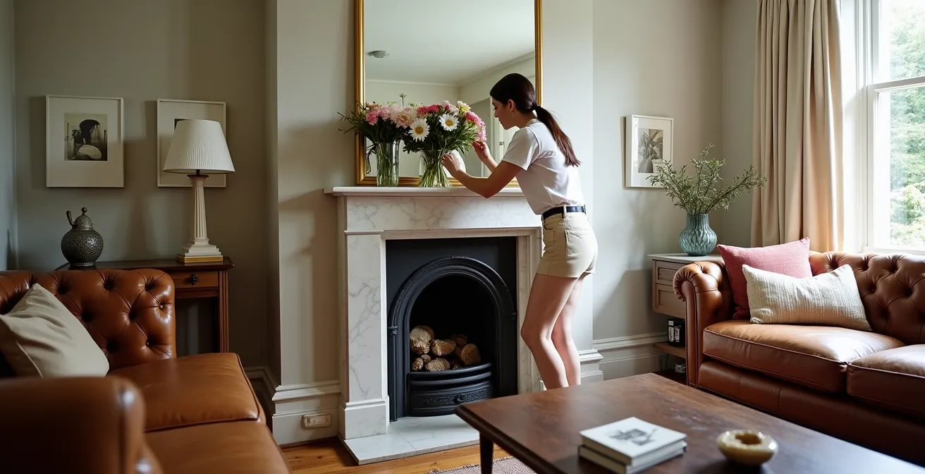
The Mistake of Removing Chimney Breasts That Devalues Your Home
In the pursuit of clean lines and maximum floor space, one of the most common and regrettable mistakes in Victorian renovations is the removal of original chimney breasts. While it may seem like a quick way to gain a square metre, it’s an act that strips the room of its primary focal point, its structural balance, and a significant portion of its character. Estate agents specialising in period properties report that such a move can reduce property value by 5-10%. A flat, featureless wall where a hearth should be often leaves a room feeling soulless and architecturally adrift.
The chimney breast is the architectural anchor of a Victorian room. It dictates the room’s natural symmetry and provides the perfect location for a central seating arrangement or a statement piece of art. Rather than viewing it as an obstruction, we should see it as an opportunity. The alcoves on either side are a gift for bespoke storage, shelving, or creating cosy reading nooks. Restoring or adding a period-appropriate fireplace surround, even if non-functional, instantly reinstates the room’s historic heart.
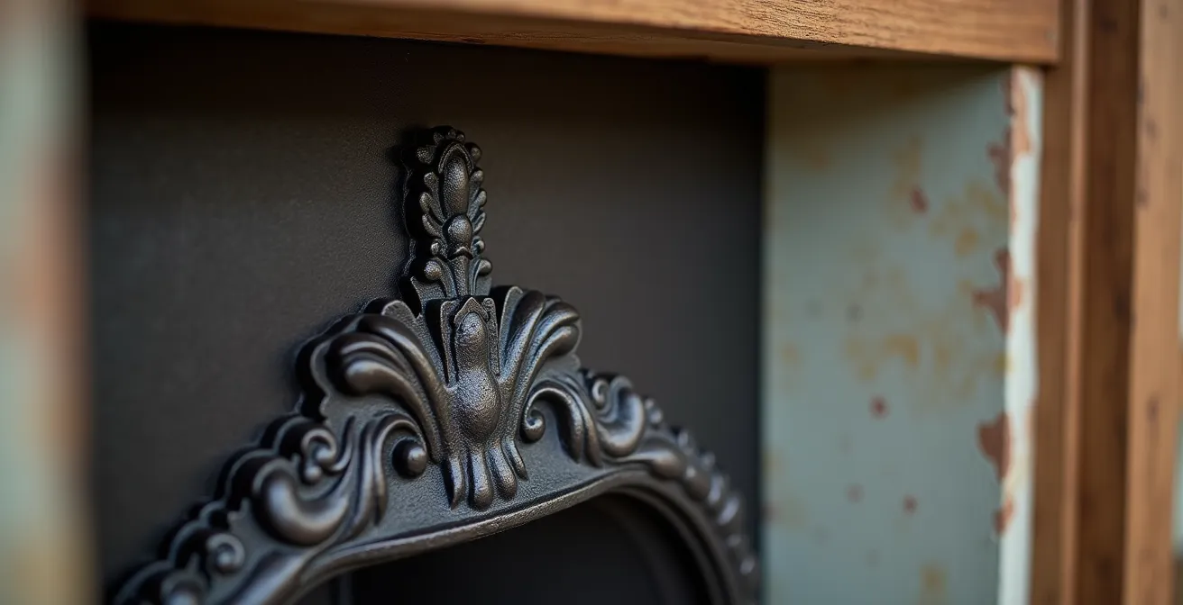
Embracing the chimney breast allows for creative solutions that add both character and practicality. Built-in joinery, as shown, transforms the alcoves from awkward recesses into a room’s most functional and beautiful feature. This approach works *with* the architecture, celebrating its inherent structure rather than fighting against it. It is the very definition of a character-enhancing, value-adding decision.
Before considering such a drastic and irreversible step, it’s vital to explore all the design possibilities that this quintessential feature offers. A well-styled chimney breast is not just a nod to the past; it’s a powerful tool for creating a dynamic and engaging contemporary living space.
How to Brighten a North-Facing Hallway with Mirrors and Paint
The long, narrow, and often dark hallway is a classic challenge in a Victorian terrace, especially when it’s north-facing. The common instinct is to douse it in brilliant white paint, but this often backfires. In the cool, indirect light of a north-facing space, pure white can appear grey, flat, and unwelcoming. The key is not to fight the darkness but to work with it, using strategic colour and reflection to create warmth and the illusion of space.
The first step is to choose the right ‘white’. Opt for off-whites with warm undertones, such as those with a hint of yellow or pink, which will counteract the cool blueish light. Surprisingly, leaning into the darkness with rich, jewel-toned colours can also be incredibly effective. A deep navy or forest green can create a dramatic, inviting entryway that feels intentional and sophisticated, making the brighter rooms beyond feel even more expansive.
We transformed our dark Victorian hallway using jewel tones rather than white, which actually made the space feel larger and more welcoming. The key was using glazed internal doors and strategic mirror placement – the original Victorian archway became our focal point rather than trying to fight the natural darkness of the space.
– Rosie Abigail, Hallway Transformation Success Story
Mirrors are your other essential tool. A large mirror placed opposite the main light source (usually the front door) will bounce light down the length of the corridor. A long runner mirror on one of the side walls can create the illusion of width. Finally, consider the doors. Swapping solid wooden doors for glazed or partially glazed versions allows you to ‘borrow’ light from adjacent, brighter rooms, a simple change with a transformative effect.
Your Checklist: Brightening a Dark Hallway
- Choose the right paint: Select off-whites with warm yellow or pink undertones. Avoid pure, cool whites which can look grey.
- Install glazed doors: Swap solid internal doors for partially or fully glazed ones to borrow light from adjoining rooms.
- Position a large mirror: Place a significant mirror directly opposite the main light source (front door) to bounce light deeper into the space.
- Create width with a runner mirror: Use a long, narrow mirror along one of the main walls to give the illusion of a wider corridor.
- Use a light-coloured runner: If you have dark original tiles, add a light-coloured floor runner, ensuring the decorative border of the tiles remains visible.
Why Lighting Is the ‘Jewellery’ of the Room
In a Victorian home, with its generous ceiling heights and grand proportions, lighting should never be an afterthought. It is the ‘jewellery’ that completes the outfit, the final layer that can either unify a scheme or undermine it entirely. A single, central pendant is a classic feature, but relying on it alone often results in a room that is overly bright in the middle and gloomy at the corners. A successful lighting plan is a layered one, combining different sources to create mood, highlight features, and provide practical illumination.
The strategy involves thinking in three distinct layers: ambient, task, and accent. Ambient lighting provides the room’s overall illumination, often from a central pendant. This is your chance to make a statement. Hanging a contemporary piece from an ornate ceiling rose creates a powerful dialogue between eras. Task lighting is functional, illuminating areas for specific activities like reading. This can be achieved with period-style floor lamps or discreet, modern directional spots. Finally, accent lighting is used to draw attention to architectural features or art—think of uplighters grazing a chimney breast or picture lights over a favourite painting.
The technology of the bulb itself is also crucial for preserving atmosphere. Modern LED bulbs are energy-efficient, but it’s essential to choose ones with a warm colour temperature (around 2700K) and, ideally, warm-dimming capabilities. This technology allows the light to become warmer in tone as it dims, perfectly mimicking the gentle glow of traditional incandescent bulbs and candlelight, which is essential for creating an inviting, historic feel in the evening.
Your Plan: The 3 Layers of Light Strategy
- Ambient Layer: Install a statement pendant from the central ceiling rose. Ensure its scale is appropriate for the rose and the room’s height. Source from UK specialists like Tom Dixon for contemporary or Jim Lawrence for reproductions.
- Task Layer: Add functional lighting where it’s needed most. This could be a period-style brass reading lamp by an armchair or discreet downlights over a kitchen work surface.
- Accent Layer: Use focused light to create drama. Use uplighting to highlight the texture of a brick chimney breast or install dedicated picture lights to make artwork pop.
- Technology Tip: Always choose LED bulbs with warm-dimming capabilities to ensure you can shift from bright, functional light to a warm, atmospheric glow, preserving the historic ambience.
Gallery Wall or Statement Wallpaper: Which Suits a Narrow Living Room?
The narrow proportions of many Victorian terrace living rooms present a specific design challenge. The goal is to add personality and visual interest without making the space feel cluttered or even smaller. Two popular solutions are the gallery wall and statement wallpaper, but they have very different effects on the perception of space. A gallery wall, composed of multiple small frames, can introduce high ‘visual noise’. If not expertly curated, it can feel chaotic and draw the walls inward, emphasizing the room’s narrowness.
A more controlled approach to a gallery wall is to use a single picture ledge or a pair of them. This groups the artwork into a cohesive horizontal line, drawing the eye along the length of the room rather than scattering it. Statement wallpaper, by contrast, offers a single, cohesive impact. A pattern with strong vertical elements—such as climbing botanicals or elegant stripes—can draw the eye upward, giving an illusion of greater ceiling height. The key is to apply it strategically: using it on the shortest end wall can make that wall advance, creating a more balanced, less ‘tunnel-like’ feel to the room’s proportions.
Case Study: Cambridge Narrow Terrace
In a 3.6-metre-wide Victorian terrace renovation, the architects chose a third, highly effective option. They avoided both scattered gallery walls and busy wallpaper, instead using single, oversized contemporary art pieces as focal points. This minimal approach created visual ‘breathing room’, while horizontal picture ledges provided display space without the clutter of multiple frames. This strategy maximized impact while enhancing the sense of space.
To help you decide, the following table compares the options, including the minimalist approach of using a single piece of oversized art, which often has the most powerful and space-enhancing effect.
| Solution | Visual Noise Level | Space Perception | Best Application |
|---|---|---|---|
| Gallery Wall | High if not curated | Can feel cluttered | Use single ledge system for control |
| Statement Wallpaper | Single cohesive impact | Vertical patterns add height | Apply to shortest end wall only |
| Single Oversized Art | Minimal | Creates ‘window’ effect | Maximum impact in tight spaces |
Key takeaways
- Styling a period home is about creating a ‘coherent dialogue’ between eras by matching material integrity, not just contrasting styles.
- Preserving original features like chimney breasts and cornicing is a financial and aesthetic investment, adding significant value and character.
- A layered lighting plan, treated as the ‘jewellery’ of the room, is essential for creating mood and highlighting architecture.
Maximalism in Small Spaces: How to Layer Without Cluttering?
Maximalism, often associated with the Victorian era’s “more is more” philosophy, can feel like a natural fit for a period terrace. However, there’s a fine line between rich, curated layering and overwhelming clutter, especially in smaller rooms. Successful maximalism isn’t about chaos; it’s a highly controlled and intentional style. It’s the continuation of the British Eccentric tradition, rooted in personal collections and storytelling, not just following a fleeting trend.
The foundational principle is ‘Controlled Palette, Varied Texture’. Instead of using a riot of colours, a successful maximalist scheme is often built on a tight palette of just three or four complementary shades. The richness comes from layering a huge variety of textures within that colour family: velvet, linen, wood, metal, glass, and heavily patterned fabrics. This creates depth and interest without creating visual noise.
Successful maximalism isn’t about throwing everything at a room. It’s about choosing a tight colour palette of 3-4 complementary shades and then layering heavily through texture.
– British Interior Designer Sean Symington, Victorian Interior Maximalism Principles
Another key is to distinguish ‘layering’ from ‘clutter’. Layering is vertical and intentional: floor-to-ceiling curtains, tall bookcases, and gallery walls that extend high up the wall draw the eye upwards and make the most of Victorian ceiling heights. Clutter, on the other hand, is often horizontal and random—piles of functional but unlovely items. In a maximalist room, every single item must earn its place by being beautiful, interesting, or deeply meaningful. It is a deeply personal style that, when done right, tells the story of its inhabitants.
Your Guide: The Rules of Curated Maximalism
- Apply the ‘Controlled Palette, Varied Texture’ principle: Limit your main colours to 3-4, but go all-out on different textures like wool, silk, metal, and wood.
- Embrace Vertical Layering: Use tall bookcases, hang curtains high and wide, and arrange art up to the ceiling to draw the eye upward and celebrate the room’s height.
- Distinguish Layering from Clutter: Layering is curated and beautiful (a stack of art books, a tray of antique bottles). Clutter is a pile of unopened mail. Be ruthless.
- Ensure every item ‘earns its place’: Before adding anything, ask if it is beautiful, interesting, or personally meaningful. If not, it doesn’t belong.
- Honour the British Eccentric tradition: View this style as a continuation of historical collecting and personal expression, not just a modern trend.
By focusing on material integrity, a coherent colour palette, and ensuring every object tells a story, you can create a space that is rich and layered yet feels harmonious and deeply personal. Begin today by auditing your space through this lens of curated layering to create a home that is truly, and characterfully, your own.